WetandPuffy.com

 Loading...
You open Wet And Puffy and you understand the direction almost instantly. The site stays very focused. Same style, same type of scenes, just different performers and small variations. If you like that specific look, it makes sense right away. If not, nothing later really changes the direction.
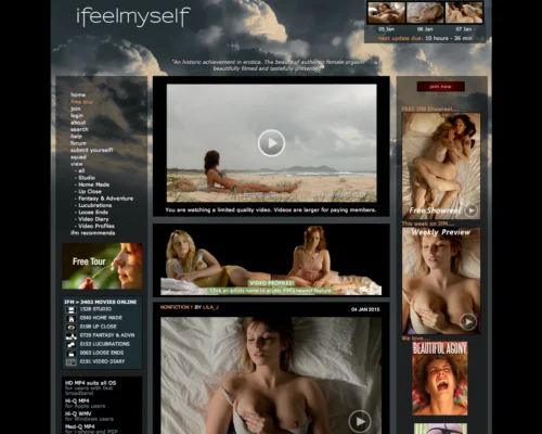
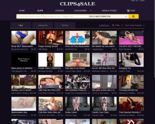
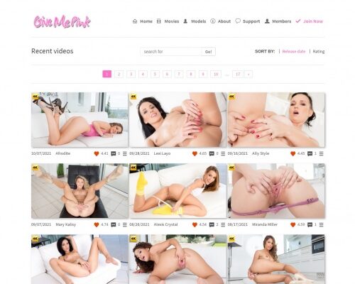
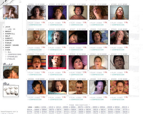
The layout is simple. Big thumbnails, performer pages, categories that mostly describe visual style. You scroll, open a profile, watch a scene, move on. After a few minutes you stop thinking about navigation because everything sits where you expect it.
Most videos feel visually similar. Close camera work, simple backgrounds, relaxed pacing. The difference usually comes from the performer — how they move, their energy, small details. That’s what keeps browsing from feeling completely repetitive even though the concept stays the same.
There’s a large library, so scrolling can take a while. You notice familiar faces after some time and start returning to performers you liked before instead of randomly exploring. That becomes the normal way of using the site.
Video quality is one of the noticeable positives. Many scenes look sharp, and photo sets often come with them, showing the same shoot from start to finish. If you like saving content, downloads are available once you’re inside.
Updates appear regularly, so the site doesn’t feel frozen. You open it, check what’s new, maybe watch something, maybe go back to favorites.
Wet And Puffy works because it stays consistent. You open it when you want that exact style, not variety. It’s more about familiarity, performer browsing, and that repeated visual approach than about exploring completely different types of scenes.