GiveMePink.com

 Loading...
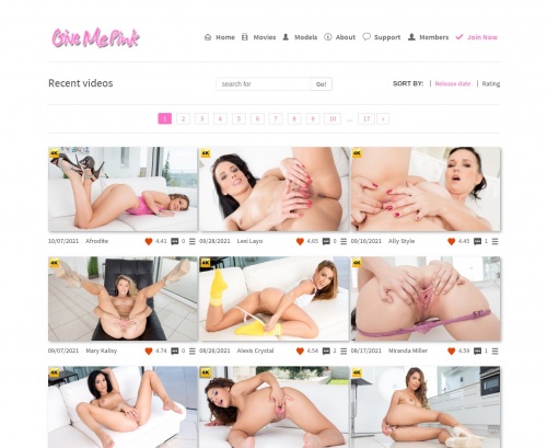
You open GiveMePink and the direction is clear almost instantly. The site sticks to one specific style, so there isn’t much guessing about what you’ll find. The pages look clean, light, and simple, which makes the whole experience feel more focused than overwhelming.
Browsing feels straightforward. Large thumbnails sit on the front page, and sections for videos and models are easy to spot. You mostly scroll, open something, then move on to the next. There aren’t pop-ups breaking the flow, which makes the time on the site feel calmer compared to many other platforms. Some pages take a moment to load, especially when switching sections, but the layout stays predictable.
The content follows a consistent pattern. Solo scenes and two-performer clips make up most of the library, and the visual style repeats often — similar backgrounds, similar filming approach, familiar pacing. After a while you start recognizing the look of the studio itself, which can make long browsing sessions feel a bit repetitive.
One helpful thing is the descriptions. Videos usually include clear info about the performers and what the scene focuses on, so you have a better idea before pressing play. Updates arrive regularly, though not constantly, which means frequent visitors may move through the catalog fairly quickly.
Language options stay limited, mostly English, with only a few pages available in another language. Because the concept is narrow and the style stays consistent, the site makes the most sense if you already know you like that specific tone. It’s less about variety and more about a stable library that keeps doing the same thing in a predictable way.